

By Erik Larsen
Water and wastewater plant operators need to turn large amounts of data into decisions to see what matters and when, without hunting through spreadsheets or navigating between disconnected systems. One of the quickest ways to do this is to use good dashboards derived from a modern data management solution designed for water industry applications.
These software programs can consolidate operational data from SCADA feeds, lab entries, and third-party sensors, incorporate regulatory calculations, and create visual dashboards that give operators, managers, and compliance staff exactly the view they need to do their jobs more quickly and with greater confidence. A dashboard should be a configurable environment where different users can build and access views tailored to their specific responsibilities.
Key Components to Look for in a Dashboard
Not all data management software is the same, and the same can be said for dashboards. Here are some powerful dashboard tools that enable water and wastewater professionals to optimize operations.
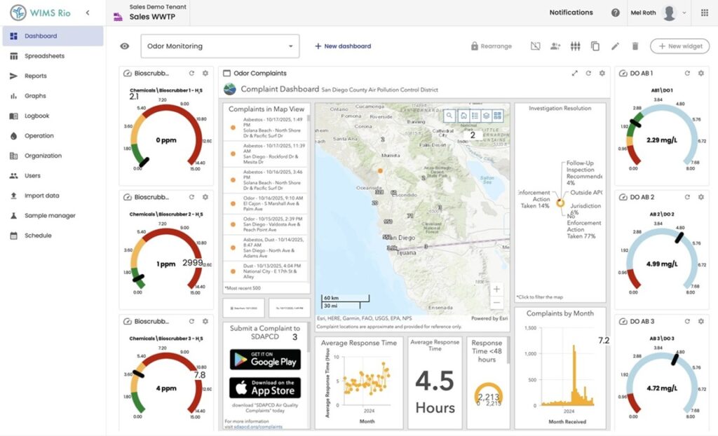
Gauges: Compliance Status at a Glance
Dashboard components, such as gauge widgets, display the most recently recorded value for a given parameter, such as plant influent flow or chemical levels, alongside the operational and regulatory limits for that parameter. By color-coding the values, operators can quickly see where the facility stands, with green indicating the plant is operating within the target range, yellow signaling a warning threshold has been crossed, and red indicating a regulatory limit is being approached or exceeded.
This means an operator walking the floor or checking in remotely doesn’t need to pull a number from memory and mentally compare it against a permit limit. A quick glance at a green gauge means everything is fine, no need for changes. Typically, systems can be configured to push email notifications to designated staff the moment a threshold is crossed.
Graphs: From Reactive to Proactive
While gauges show where a plant stands, graphs show where the plant is heading. Trending is one of the most powerful tools available to plant operators, and dashboard graphs put it front and center without requiring any manual data export or charting work.
A TOC (total organic carbon) removal graph, for instance, can display raw TOC, point-of-entry TOC, finished water TOC, and calculated percent removal on a single panel. Furthermore, users can navigate backward or forward in time to examine historical performance. This helps operators to spot the early signs of a process shift long before it becomes a compliance issue. A rising TOC trend after a storm event, or a drop in removal efficiency correlated with a change in chemical feed, becomes visible days before it would otherwise appear in a weekly report.
Graphs can also help with maintenance planning. Probe calibration history, instrument drift, and routine maintenance intervals can all be tracked visually, helping teams stay ahead of equipment issues.
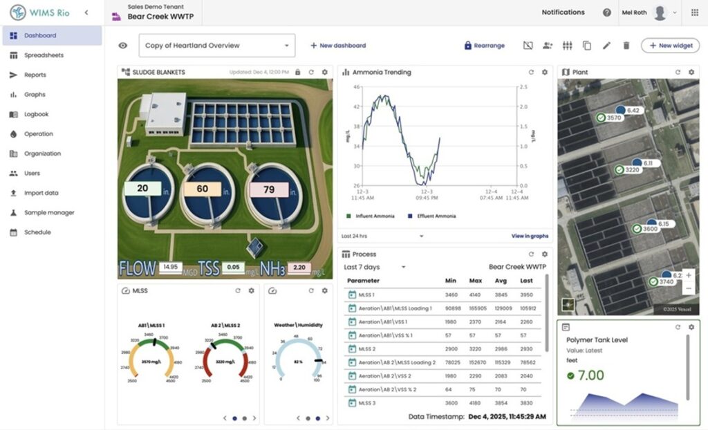
Schematics: Seeing the Plant, Not Just the Numbers
Schematics take the dashboards a step further by overlaying live data directly onto a visual representation of the plant’s physical processes. Rather than interpreting a table of numbers and mentally mapping them to process units, operators can see their headworks, clarifiers, filters, and distribution infrastructure depicted graphically, with current readings displayed in context.
A wastewater treatment schematic might show sludge blanket depth across multiple clarifiers, DO levels in aeration basins, and phosphorus removal performance all at once on a single diagram of the actual process flow. A drinking water distribution schematic can map hydrant locations, booster station status, and pressure zone readings across a service territory.
KPIs and Visual Summary Tables for Compliance
For compliance-focused users, Key Performance Indicator (KPI) dashboards provide exactly the summary layer that daily discharge monitoring reports (DMRs) and permit tracking require. KPI tables can display running averages, maximum values, and permit thresholds for parameters such as trihalomethanes (THMs), haloacetic acids (HAAs), and turbidity across multiple points in the treatment train (raw water, intermediate stages, and finished water) in a single, color-coded table.
This type of view is particularly valuable for plant managers and compliance staff who need to assess regulatory status without diving into raw data. A turbidity KPI table showing readings at the clarifier, filter effluent, and distribution entry point instantly communicates whether the plant is within acceptable bounds and flags any location that warrants follow-up attention.
Geolocation Maps Connect Data to Place
Geolocation map widgets within a dashboard can tie water quality and operational readings to specific physical locations, such as sampling sites, booster stations, storage tanks, pressure zones, etc., and display the values on an interactive map of the service area.
For a utility managing a large distribution network, this means compliance status isn’t just a number in a spreadsheet; it’s a point on a map. Field staff can see exactly which locations have been sampled, which are overdue, and whether any sites are showing readings outside target ranges, reflected by color coding. When combined with audit trail functionality, geolocation maps also support the documentation requirements regulators increasingly expect.
Dig Deep when Choosing your Platform
When choosing a modern data management solution, be sure to request a deep dive into its dashboard capabilities. Good dashboards should provide the following outcomes.
Faster Data Mining Across Timeframes
Whether an operator needs to review yesterday’s turbidity readings or compare this month’s TOC removal performance against the same period last year, dashboards should make that retrieval immediate.
Role-Specific Customization
A data management program should serve multiple user types simultaneously. Dashboards should also be configured independently for each role without requiring separate systems or data exports. Lab staff may need a view centered on analytical results and QC checks. Plant operators may prioritize process gauges and schematics. Managers may focus on KPI summaries and trend lines.
Integration Across Data Sources
A robust dashboard integrates SCADA inputs, laboratory results, manual field entries, calculated parameters, and external reference data into one coherent view. That integration eliminates the fragmented, multi-system workflow that costs operations teams hours every week and occasionally leads to compliance gaps when data lives in different places.

Erik Larsen is strategic marketing manager for Aquatic Informatics. Larsen is a digital solutions expert with a special focus on AI and machine learning, data and analytics and managed services.









Leave a Reply